Overview
The Overview (in the navigation: the "Overview" tab) is the first page every signed-in user with access to the organization's data sees. It shows an aggregate view of all projects and the list of favourite items.
Visibility of some elements depends on the organization's configuration and the purchased package. This description assumes all of them are enabled.Favourites
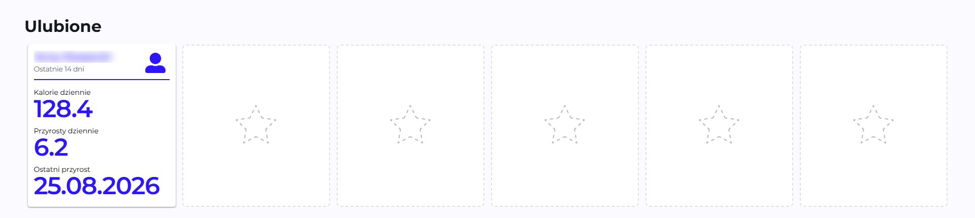
The carousel at the top of the page lets you pin the projects, teams and participants you track most often. The star works as a toggle: clicking it next to any row in the projects, teams or participants table, or in the header of a details page for a given item, adds it to this carousel; clicking it again removes it from there. Each card shows three numbers for the last 14 days, regardless of the date range selected for the rest of the page:
-
Daily Calories (participant) / Calories per person (project, team): the average daily development effort (Calories) over the last 14 days.
-
Daily Increments (participant) / Increments per person (project, team): the average daily number of recorded changes (commits, tickets, etc.) over the last 14 days.
-
Last increment: the date of the most recent recorded activity.
Calories and Increments are Q247's own units for measuring development effort. → Calories, Increments and Lines
Clicking a card goes to the details of that item. The carousel stays empty until something has been starred.
AI Adoption

Below the Favourites carousel there is a panel summarizing AI adoption across the whole organization, broken down by project. The panel shows:
- % adoption: what share of calories (development effort) in the selected period was produced with the help of AI, compared to the previous period (e.g. "▲26pp").
- AI cal: the sum of calories generated with the help of AI.
- Tokens: the number of tokens consumed by AI tools.
- AI spend: the estimated cost of AI usage in this period.
- A chart compares the adoption trend in the current period against the previous one.
The "Expand" button expands the panel into a view with a list of projects:
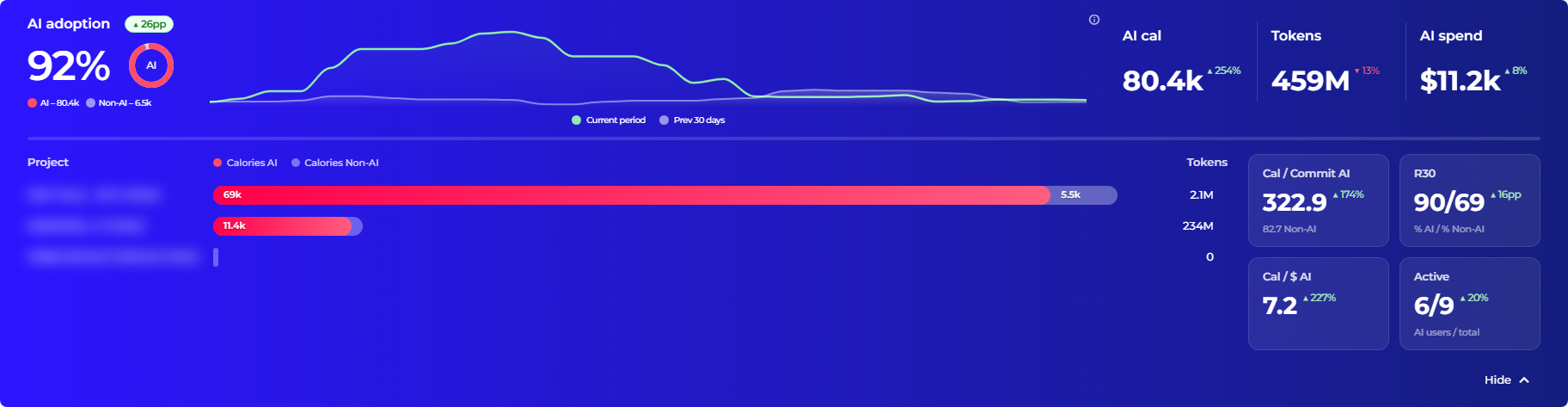
The list of projects is sorted in descending order starting with the one that generated the most calories using AI (the "Calories AI" column). For each project you can also see calories without AI, the number of tokens, and additional indicators: calories per AI commit, R30 retention split by AI/non-AI, cost per dollar, and the number of active AI users against all of them.
→ AI Adoption: the full description of these indicators and the recognized AI tools.
Project health summary
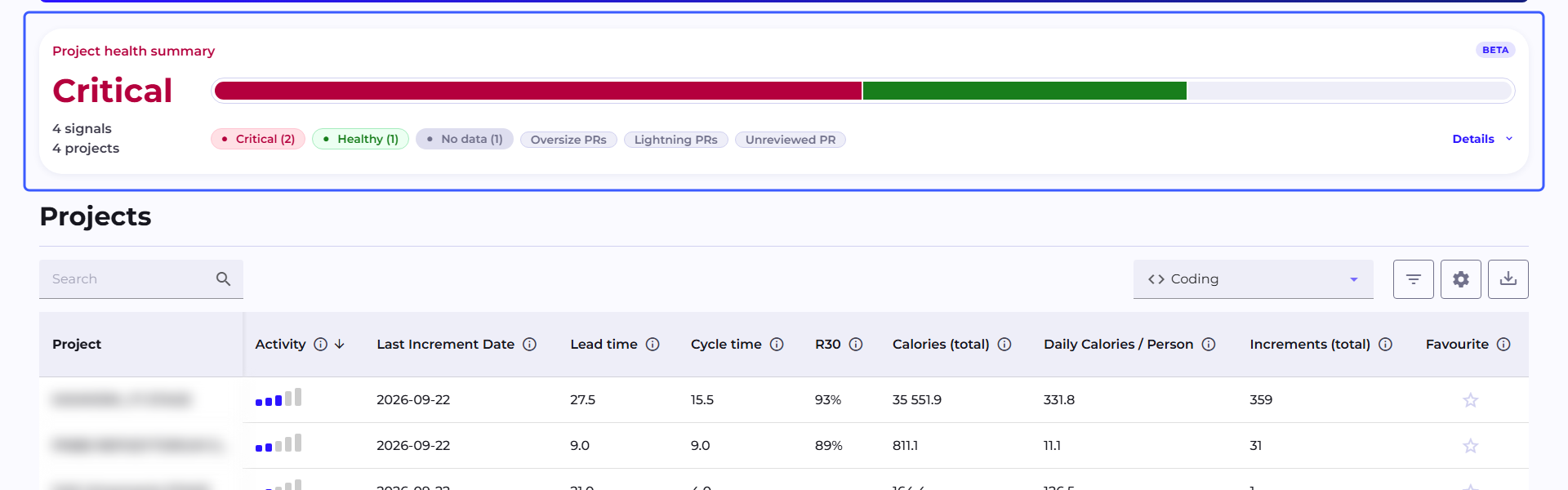
The "Project health summary" section shows the health metrics score for every project in your reach. The header carries the score for the whole organization, plus a line with the number of active signals and the number of projects they concern.
Node cards are ordered starting with the ones with the most bad signals, twenty per page. Above them are two independent pill filters: state pills with counters, and pills for the individual metrics. Within one row of pills the selections add up, and between rows they narrow the result, so selecting the Critical state together with the Stale PRs metric shows nodes that are critical for exactly that reason. A pill with a zero counter is hidden.
The horizontal bar above the cards shows the distribution of all nodes across the four states at once.
The same score is visible in the header of the Project page, together with pills for the individual metrics.
The section appears only when the administrator has enabled health metrics, and the account has access to whole-project data, meaning the Manager or Viewer role. The Member role sees the projects table below, but not the health section.
The full description of the metrics, thresholds and states is on the Health Metrics page.
Projects table
The table of all of the organization's projects, with a toolbar:

-
Search: searches by project name.
-
Calories Type selector (in the screenshot: "Coding"): switches which activity the metrics are calculated from: Total / Coding / Documentation. A full description of these options is on the Calories Type page. The choice is remembered only for this page. Changing it here does not affect what is selected on the Teams list or on the Team page, each of these pages has its own, independent setting.
-
The filter icon: opens the "Filter" window with separate conditions for each column. Text columns offer a multi-value pick list, numeric columns an operator (
>,>=,=,!=,<,<=) and a value, date columns a from-to range. The "Clear All" and "Apply All" buttons act on all of the set conditions at once. The number of active filters is shown as a badge on the icon. -
The gear icon opens the "Customize table content" window, which lets you turn individual metric columns on and off, grouped into categories (the "Select All" button selects a whole category at once). The full list of categories and metrics is in the tables in the "Statistics available in the table" section:

-
The down-arrow icon: exports the visible columns and rows to CSV.
By default the table is sorted in descending order by the Activity column. Here is what the table looks like with the default columns and sample data:

Statistics available in the table
All the metrics that can be turned on in the "Customize table content" window, grouped into 7 categories exactly as in that window. A short description of each, with full formulas and details behind the links.
Additional information
| Column | What it shows | Visible by default |
|---|---|---|
| First Increment Date | The project's first activity, from the entire history. | No |
| Last Increment Date | The last recorded activity, from the entire history. | Yes |
| Duration | The number of calendar days with activity in the selected date range. | No |
| Team Capacity | How many people actually worked in the project in this period. | No |
| Effective Team Capacity | How many people worked on average each business day of the selected period. | No |
→ Activity period · Team Capacity
Flow Metrics
| Column | What it shows | Visible by default |
|---|---|---|
| Lead Time | The median business days from the creation of a ticket to its completion. | Yes |
| Cycle Time | The median business days from starting work on a ticket to completion. | Yes |
Both columns are available in the edit columns window only when the project has an integration with a ticketing system (Jira). Without it, they do not appear as an option to enable: they cannot be added, they are not hidden as empty.
Retention
| Column | What it shows | Visible by default |
|---|---|---|
| R1 | What percentage of added lines of code survived, meaning it was not overwritten or deleted, after 1 day. Each indicator is calculated in a shifted window of as many days as its name states. | No |
| R7 | What percentage of added lines of code survived after 7 days. | No |
| R30 | What percentage of added lines of code survived after 30 days. | Yes |
| R90 | What percentage of added lines of code survived after 90 days. | No |
Work Dynamics Indexes
| Column | What it shows | Visible by default |
|---|---|---|
| Activity* | A composite indicator of the project's overall activity (0-100%), the average of the four metrics below in the same category. | Yes |
| Presence | What % of business days had any activity. | No |
| Effort | How intensive the work was relative to the assumed target (calories per business day). | No |
| Output level | How regularly increments were produced relative to the assumed target. | No |
| Work Rhythm | How evenly activity was distributed over time, without long gaps or clusters. | No |
| Business Days | The number of business days in the selected period, excluding weekends and holidays: the basis for calculating the other metrics in this category. | No |
*Activity is also the table's default sort criterion.
Calories
| Column | What it shows | Visible by default |
|---|---|---|
| Calories (total) | The sum of the development effort (Calories) of the whole project in the selected period. | Yes |
| Daily Calories / Person | The average daily effort per person in the project. | Yes |
Increments
| Column | What it shows | Visible by default |
|---|---|---|
| Increments (total) | The total number of recorded changes (commits, tickets, etc.) in the project. | Yes |
| Daily Increments / Person | The average daily number of increments per person. | No |
Lines
| Column | What it shows | Visible by default |
|---|---|---|
| Lines (total) | The total number of lines of code changed in the project. | No |
| Daily Lines / Person | The average daily number of lines per person. | No |
→ Calories, Increments and Lines
See also
- Project: project details after clicking a row in the table
- Teams: the same kind of view, but for teams instead of projects
- AI Adoption