Project
This page shows the details of a single project. It opens after clicking a row in the projects table on the Overview or clicking a card in the Favourites carousel. The Q247 interface has no generic name of its own for this view; it only shows the name of the specific project. "Project" is a descriptive name used in this documentation, not a literal string from the application.
A project in Q247 is a set of data sources assigned to it: code repositories and documentation sources. This page therefore shows work grouped by what it was done on, regardless of who did it and which team they belong to. The same events, seen from the perspective of people, are shown by Team, and the relationship between these two views is explained by Dashboards.
Project header

The "GO BACK" button returns to the previous list. The star next to the project name works as a toggle: it adds or removes the project from the Favourites carousel on the Overview. The "PM:" labels below the name show the project managers; the description of who can manage a project's data is on the Permissions page. The "Select project" dropdown on the right lets you switch to another project without going back to the list.
The Calories Type selector (in the screenshot: "Coding") appears in several places on this page: next to the Delivery tracker chart, in Workload and in the Participants table. It is one shared choice: Total / Coding / Documentation (full description on the Calories Type page). Changing it in one place changes it everywhere else, and it applies to every project you visit, but it is still your own setting, saved locally, not something shared with other users of the organization. Cards in the "Team metrics" section do not depend on this selector: their values do not change, regardless of the selected option.
Health in the header

When the organization has health metrics enabled, a Health: {state} pill appears in the header, with one of four scores: Healthy, Watch, Critical or No data. The score comes from the worst scored metric, and its tooltip explains where it comes from.
Next to it are pills for the individual metrics, but only those in the Watch and Critical states. A healthy metric, and a metric that has not collected the minimum sample, get no pill, so an empty row next to a Healthy score is a normal view.
The same score is visible on this project's card in the health summary section on the Overview.
Team metrics

A card strip summarizing the project for the selected date range:
-
Last Increment Date: the date of the last recorded activity, and below it the date of the first activity in the project. → Activity period
-
Effective Team Capacity: the effective number of people actually involved in the project during this period, lower than the raw number of participants if some of them joined or left partway through. → Team Capacity
-
Lead Time: the median number of business days from the creation of a ticket to its completion.
-
Cycle Time: the median number of business days from starting work on a ticket to its completion.
-
Throughput: the pace of completing tickets, in tasks per week.
-
Flow velocity: the number of tickets completed in the selected period.
-
Work in progress: the number of tickets in progress at the end of the selected period.
-
Flow distribution: the split of completed tickets into features and bugs.
These 6 cards are visible only when the project has a configured integration with a ticketing system (Jira); without it, they do not appear. → Flow Metrics
-
Calories (total): the sum of the development effort (Calories) of the whole project in this period.
-
Calories per person: the average Calories per person in the project.
-
Calories per increment: the average number of Calories per increment (commit, ticket, etc.).
-
Increments (total): the total number of recorded changes (commits, tickets, etc.) in the project.
-
Increments per person: the average number of increments per person in the project.
Percentages next to some values compare the selected period with the same period immediately before it.
Delivery tracker
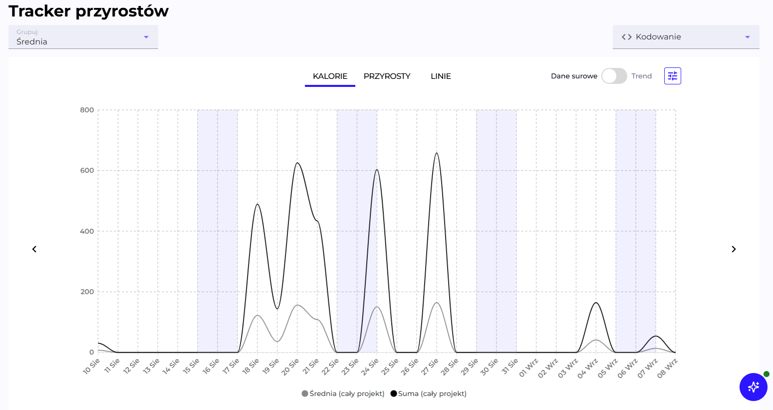
The chart shows activity in the project day by day. The CALORIES / INCREMENTS / LINES tabs switch which of the metrics from Calories, Increments and Lines the chart represents. The Raw data / Trend toggle replaces daily values with a 14-day moving average, which smooths out fluctuations and makes the trend easier to see. The shaded bands in the background are weekends.
The Group selector (default "Average") decides whose series are visible on the chart:
- Top N participants / Least active N participants: shows only the specified number of participants with the highest or lowest activity.
- Average: the default view, two aggregate lines, "Sum" (black, the sum of all participants) and "Average" (grey, the average per participant). Individual participants are then greyed out in the legend, but still visible there.
- All participants: each participant as a separate line.
- Selected participants...: a manual choice of specific people from a searchable dropdown. Once confirmed, the selector shows how many people are selected. Useful in large teams, where the Top N list does not cover the people you want to compare. The chart holds at most 500 people; once that limit is reached, adding another one requires deselecting somebody else.
Clicking a name in the legend turns a single line on or off, regardless of the selected Group option. Clicking a point on the chart opens the list of commits from that day.
OTIF - Retention

A widget with four indicators: what percentage of added lines of code survived, meaning it was not overwritten or deleted, after 1, 7, 30 and 90 days. Each indicator is calculated in a window shifted by as many days as its name states. → Retention
AI Adoption

The AI Adoption panel summarizing AI adoption in this project. It shows:
- % adoption: what share of calories (development effort) in the selected period was produced with the help of AI, compared to the previous period.
- AI cal: the sum of calories generated with the help of AI.
- Tokens: the number of tokens consumed by AI tools.
- AI spend: the estimated cost of AI usage in this period.
- A chart compares the adoption trend in the current period against the previous one.
The "Expand" button shows a list of the project's participants, sorted in descending order starting with the one who generated the most calories with the help of AI, with additional indicators (calories without AI, tokens, calories per AI commit, R30 retention split by AI/non-AI, cost per dollar, number of active AI users). The "Hide" button collapses the list again. → AI Adoption
Workload
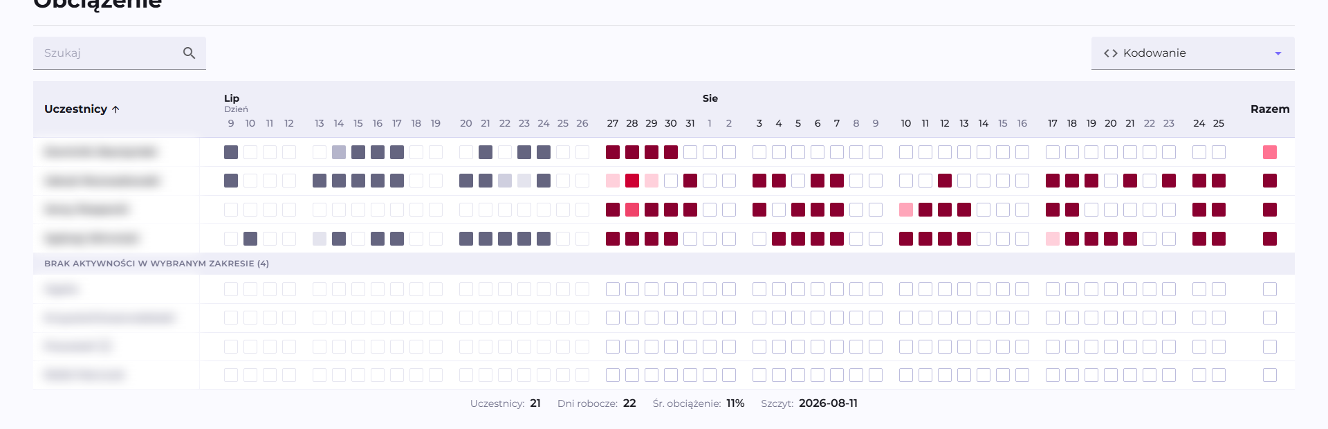
A heatmap showing how calories in the project are distributed among participants over time. Columns are consecutive days, weeks, months or quarters: for a longer date range or a narrower browser window, Q247 automatically groups columns into larger periods so they fit on the screen. This affects only the grouping, not the data itself. The "NO ACTIVITY IN THE SELECTED RANGE" row collects participants with no activity in this period. At the bottom: the number of participants, the number of business days in the range, the average workload and the day with peak activity. → Workload
Participants
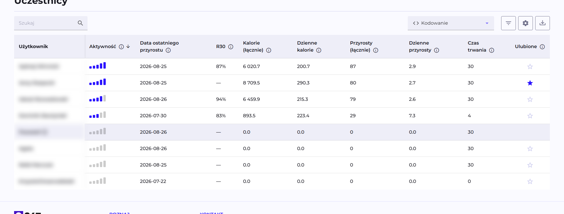
The project's participants table, with a toolbar:
- Search: searches by participant name.
- Calories Type selector.
- The filter icon: opens the "Filter" window with separate conditions for each column.
- The gear icon: opens the "Customize table content" window, turning columns grouped into categories on and off.
- The down-arrow icon: exports the visible columns and rows to CSV.
Clicking a row goes to the participant's details in the context of this project. Default visible columns: Activity, Last Increment Date, R30, Calories (total), Daily Calories, Increments (total), Daily Increments, Duration and Favourite.
Statistics available in the table
All the metrics that can be turned on in the "Customize table content" window, grouped into 6 categories exactly as in that window.
Additional information
| Column | What it shows | Visible by default |
|---|---|---|
| Grade | A letter A-E (or X when there is no data), showing how a person compares to the other participants of this project. | No |
| The participant's e-mail address. | No | |
| First Increment Date | The participant's first activity, from the entire history. | No |
| Last Increment Date | The last recorded activity, from the entire history. | Yes |
| Duration | The number of calendar days with activity in the selected date range. | Yes |
→ Grade · Activity period
Retention
| Column | What it shows | Visible by default |
|---|---|---|
| R1 | What percentage of added lines of code survived, meaning it was not overwritten or deleted, after 1 day. Each indicator is calculated in a shifted window of as many days as its name states. | No |
| R7 | What percentage of added lines of code survived after 7 days. | No |
| R30 | What percentage of added lines of code survived after 30 days. | Yes |
| R90 | What percentage of added lines of code survived after 90 days. | No |
Work Dynamics Indexes
| Column | What it shows | Visible by default |
|---|---|---|
| Activity | A composite indicator of a participant's overall activity (0-100%), the average of the four metrics below in the same category. | Yes |
| Presence | What % of business days had any activity. | No |
| Effort | How intensive the work was relative to the assumed target (calories per business day). | No |
| Output level | How regularly increments were produced relative to the assumed target. | No |
| Work Rhythm | How evenly activity was distributed over time, without long gaps or clusters. | No |
| Business Days | The number of business days in the selected period, excluding weekends and holidays. | No |
| Productive Days | The number of business days in which the participant had any activity. | No |
| Days Between Increment | The average number of business days between a participant's consecutive increments. | No |
| Non Productive Days | The number of business days with no activity from the participant. | No |
Calories
| Column | What it shows | Visible by default |
|---|---|---|
| Calories (total) | The sum of the participant's development effort (Calories) in the selected period. | Yes |
| Daily Calories | The participant's average daily effort. | Yes |
| Calories / Increment | The average number of Calories per increment. | No |
Increments
| Column | What it shows | Visible by default |
|---|---|---|
| Increments (total) | The total number of recorded changes (commits, tickets, etc.) by the participant. | Yes |
| Daily Increments | The participant's average daily number of increments. | Yes |
Lines
| Column | What it shows | Visible by default |
|---|---|---|
| Lines (total) | The total number of lines of code changed by the participant. | No |
| Daily Lines | The participant's average daily number of lines. | No |
→ Calories, Increments and Lines
This table does not have a "Flow Metrics" category: Lead Time and Cycle Time are metrics calculated only at the project level, not for a single participant.
AI Assistant

A blue, round button in the bottom right corner, visible only on this page among all the views. A dot next to the button shows the state: orange while the project analysis is still running, green when the result is ready to read.
Clicking the button opens a panel with an automatic analysis of the project, described in natural language and in the language currently selected in the application interface. The panel can be dragged by its left or top edge, or by a corner, to resize it. Clicking the button again, or the X icon in the panel header, closes it. The analysis does not stop running in the background, so the panel can be closed safely and returned to later.
→ AI Assistant: what exactly the finished answer can show, and what is visible before it is ready.
See also
- Overview: the table of all projects, from which you land on this page
- Participant: details of a single participant
- Flow Metrics